Limited Edition Packaging
This was a packaging concept in which I redesigned and manufactured limited edition packaging. I chose a classic men's grooming brand, Baxter of California.
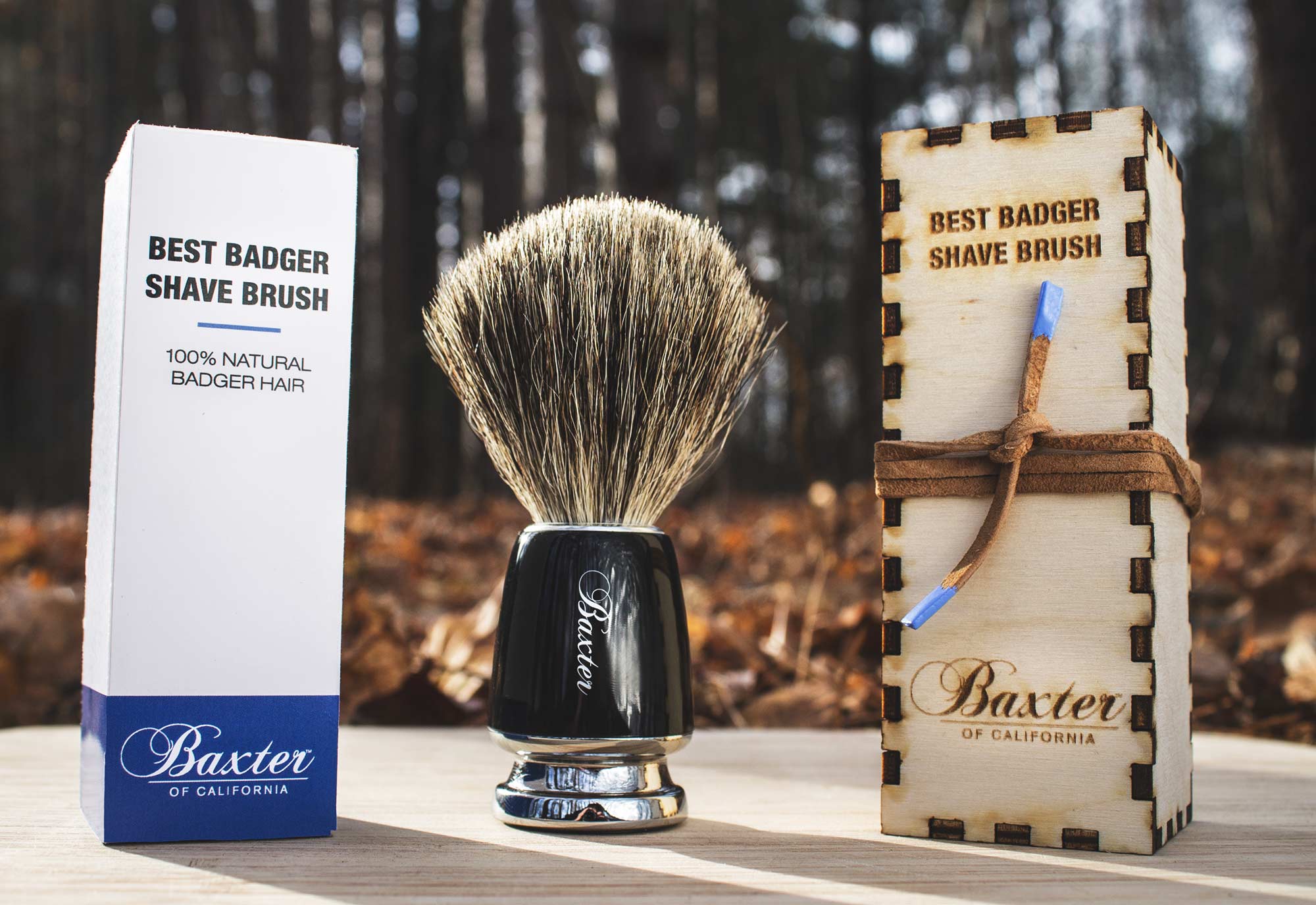
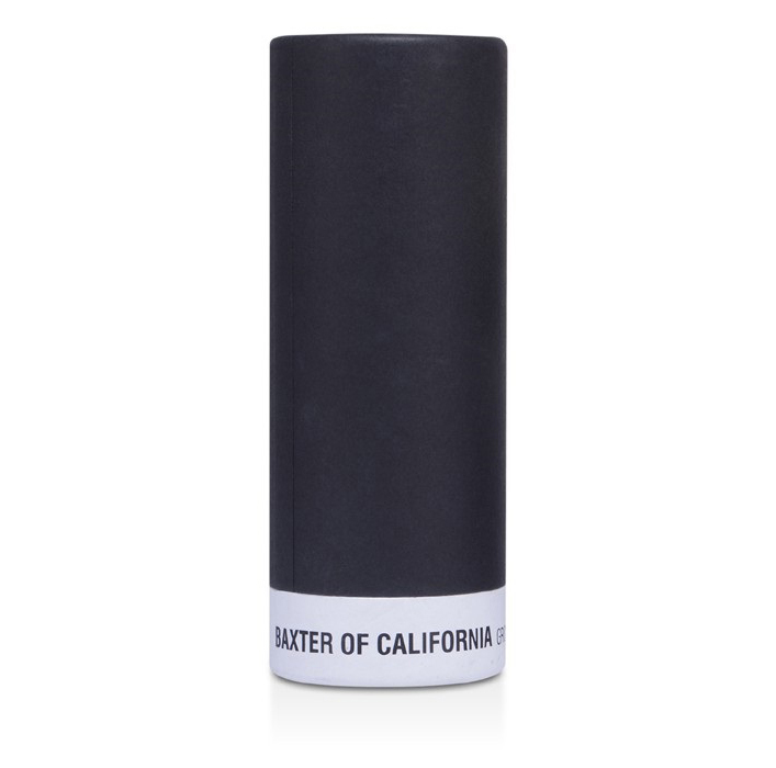
Original Packaging.
This is the current packaging for the product.

The Design Process
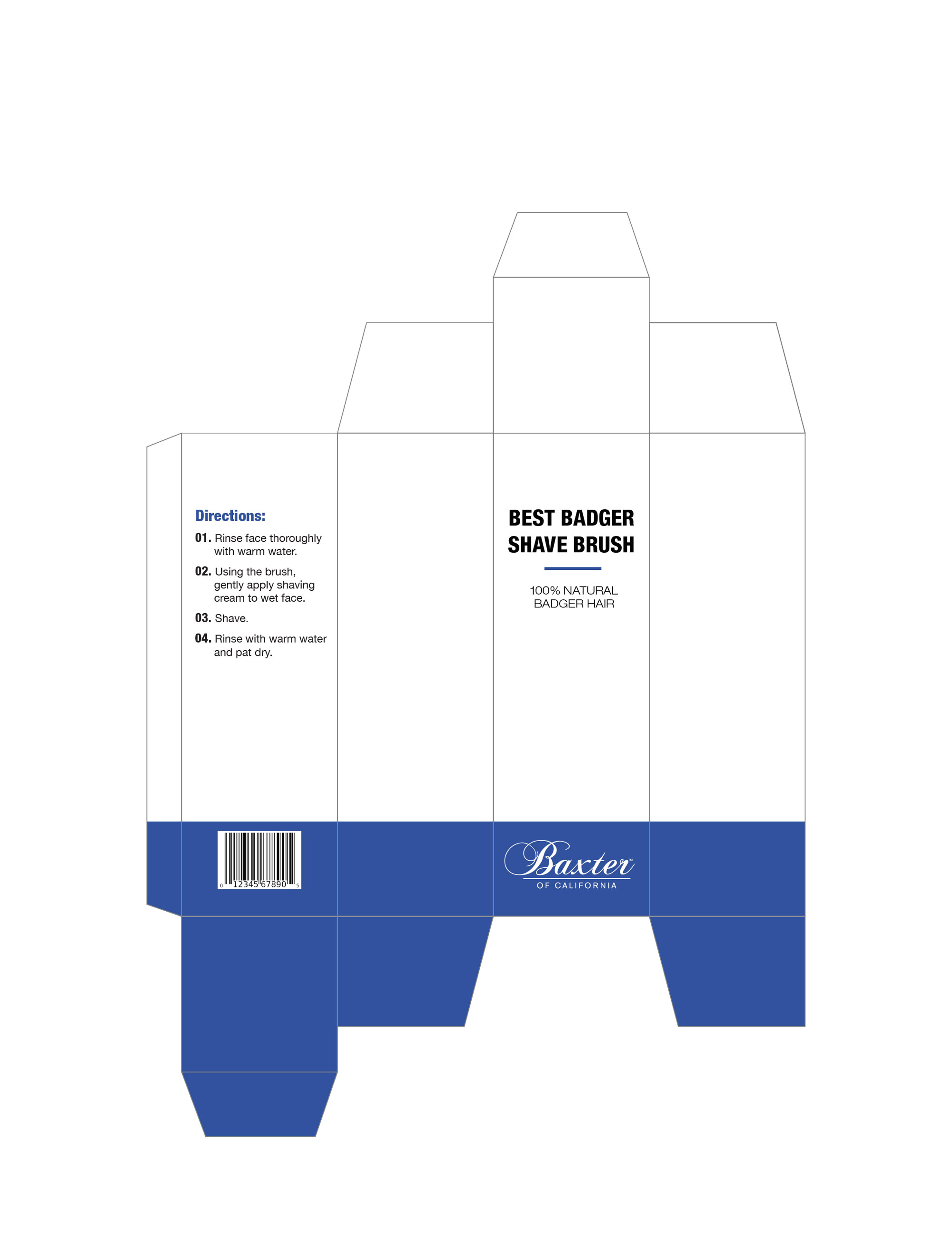
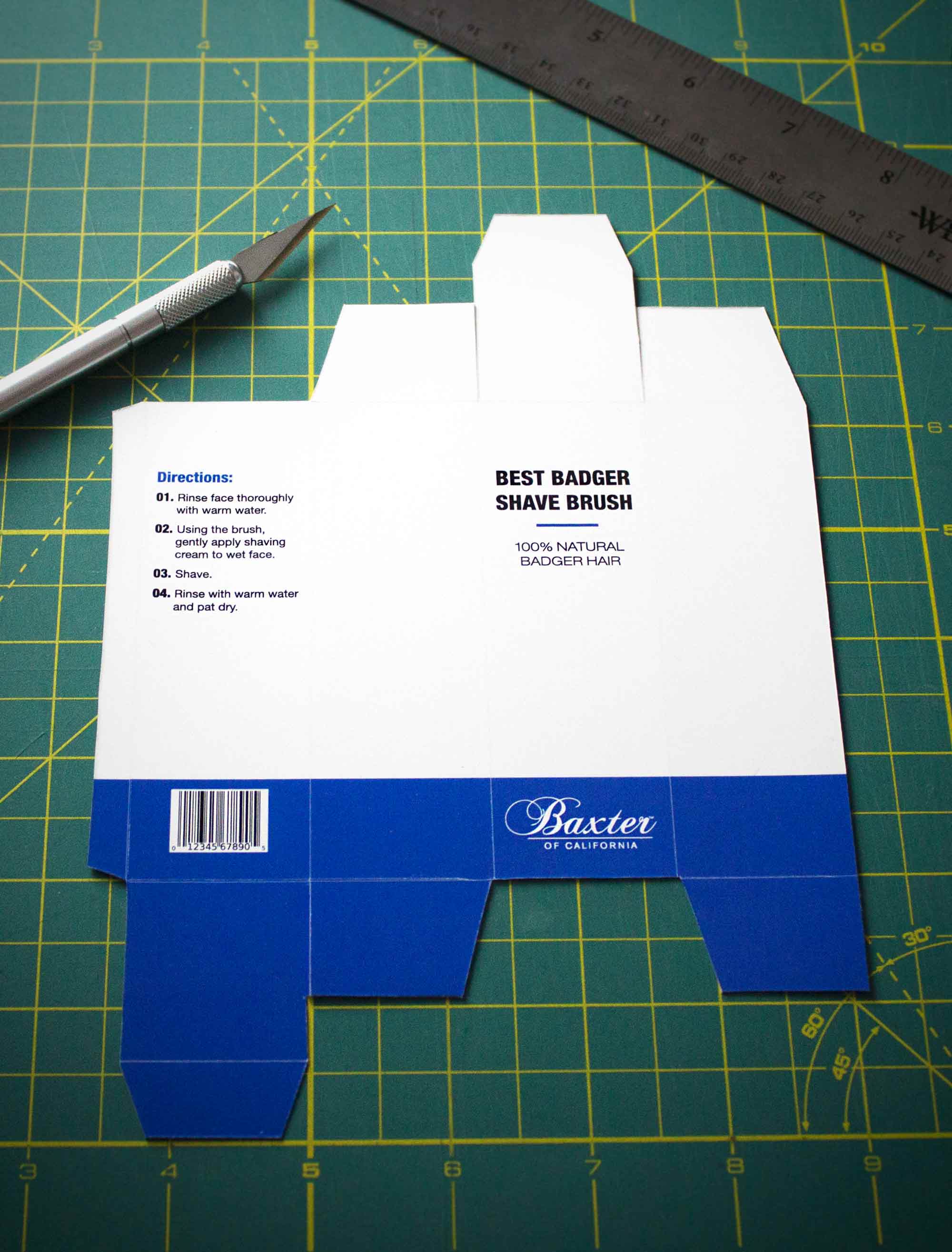
When considering options for this limited edition packaging, I immediately thought of wood as an option for material. I knew I wanted to create something that had the capability of standing out on the shelf and that prospective consumers may retain as a keepsake instead of disposing. Although I didn't mind the original packaging, it lacked any attributes that would attract attention to it on the shelves or equip it with any noteworthy characteristics in order to be showcased as a limited edition product. I also felt that there was a lack of brand representation on the original black and white packaging, having no sign of the signature Baxter of California blue that appears on the vast majority of their products.
The Box
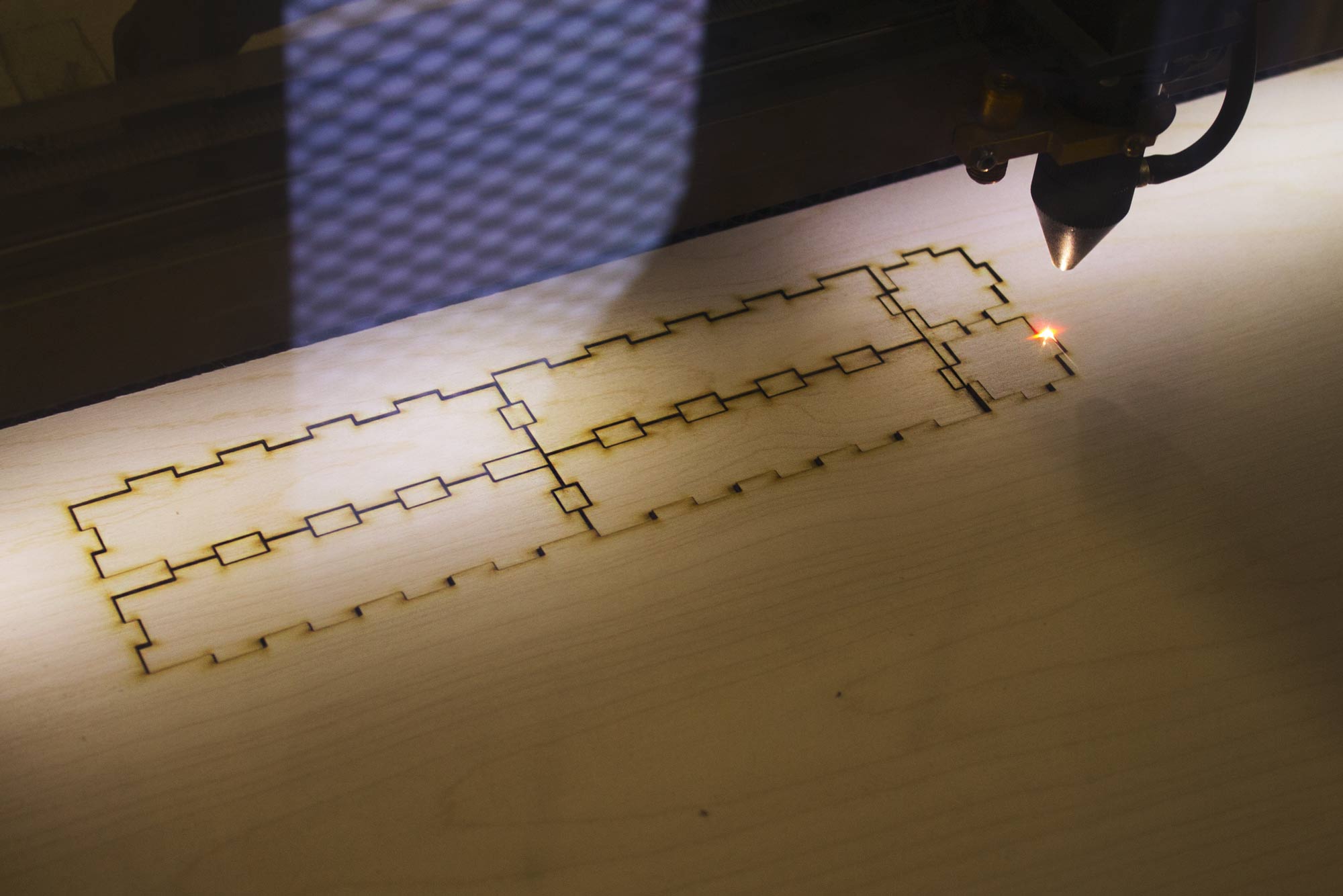
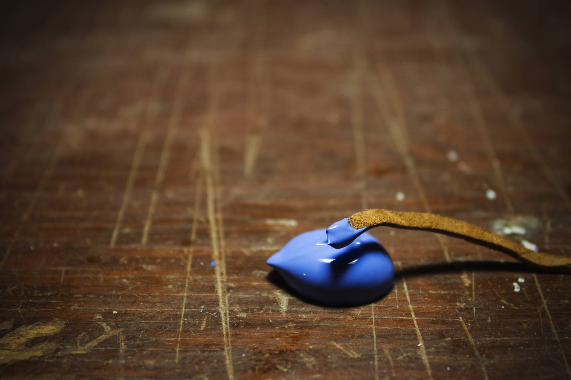
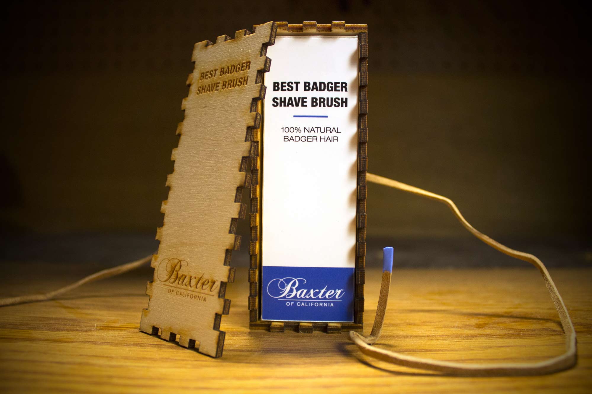
I created the wood box using a laser etching printer from a local woodworking shop. I wanted the wood box to fit tightly around the cardboard box to avoid any potential movement. For the design on the wood box, it was my intention to replicate the design of the cardboard box but remove any supporting information or features - making the focus on the wood texture and the craftsmanship of the box. I also dipped the tips of the suede rope in blue paint as a subtle visual link and representation to the Baxter of California brand in the smallest details of the packaging.

