A New Look For an Established Business
This was a rebrand for a local electrical company.
Original Logo.
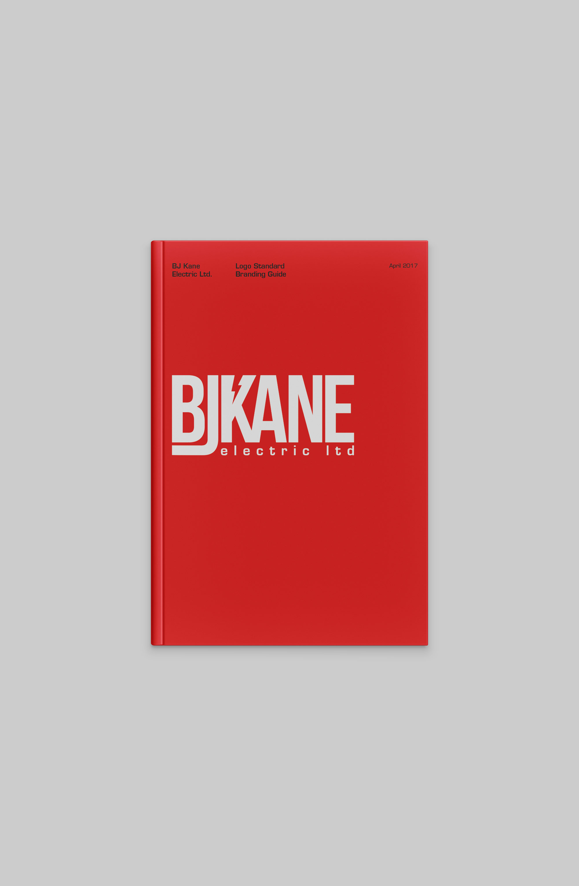
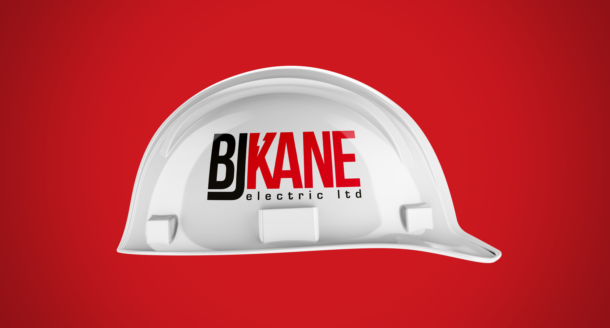
This is the current logo for BJ Kane Electric Ltd.


The Design Process
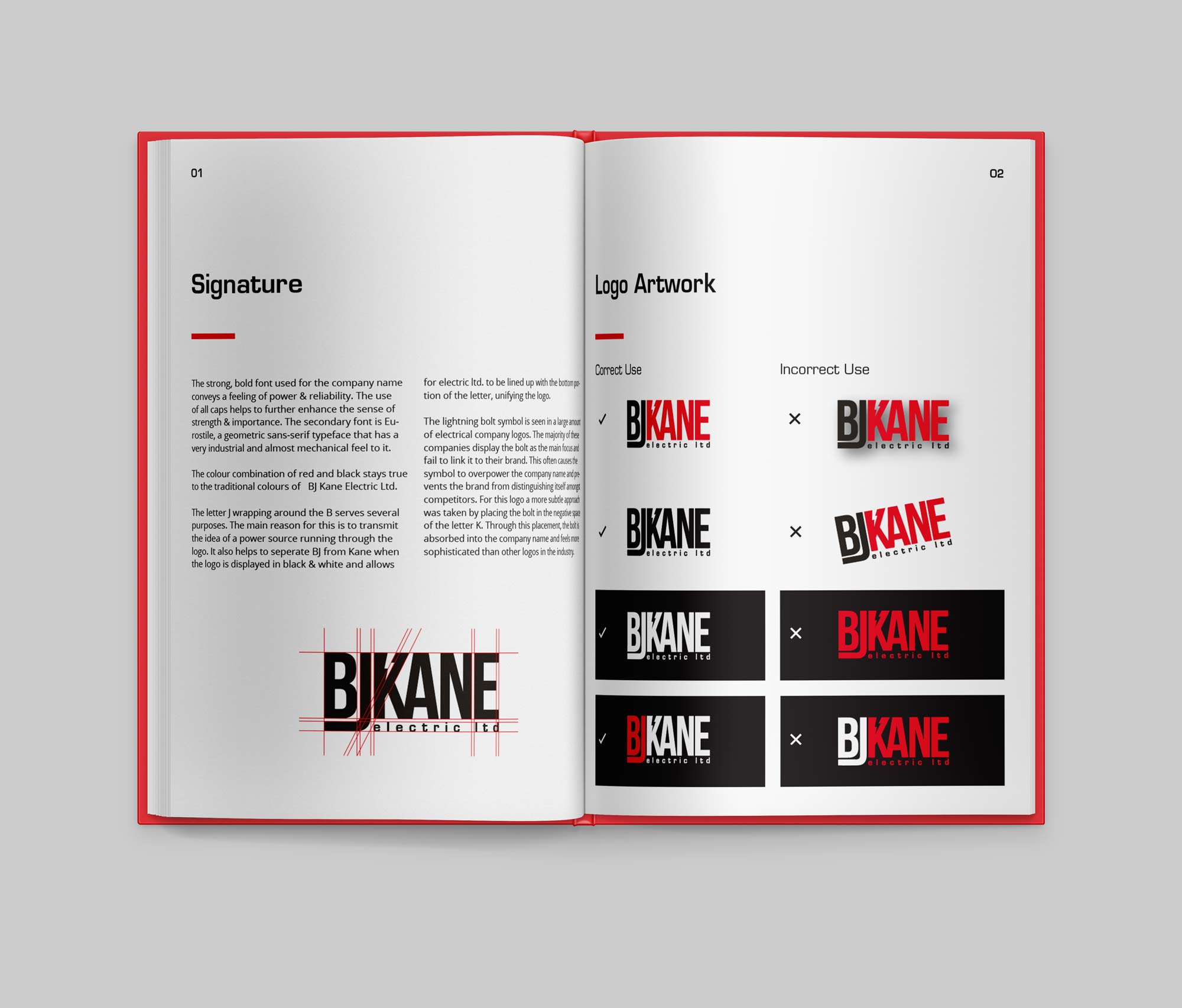
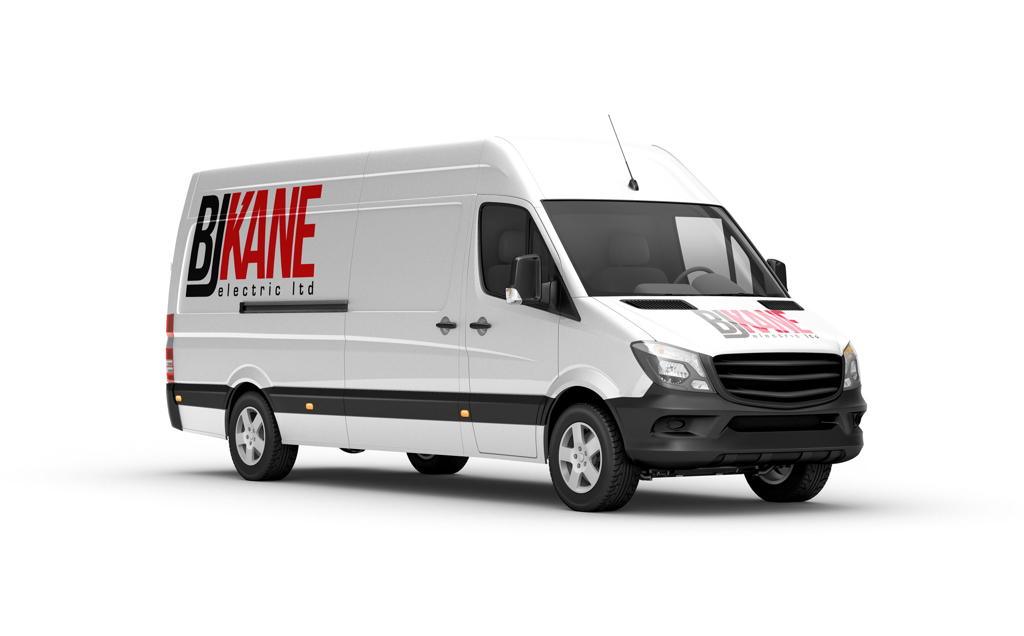
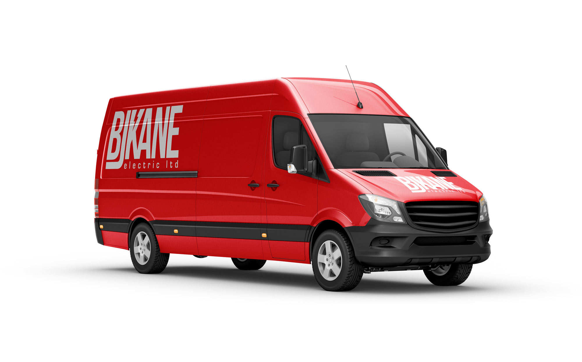
The goal for this redesign was to create a more modern and structured visual identity for the company. The bold font set in all caps communicates strength and reliability. Making the text the primary focus was also a deliberate attempt for the logo and name to be easily recognized on company vans and trucks. The letter J wrapping around the B serves several purposes. The first is to emit the idea of a power source running through the logo. The second is that it separates BJ from Kane when the logo is displayed in one colour. Lastly, it enables electric ltd. to be lined up with the descender of the J, unifying the logo and preserving the strong rectangular shape of the mark.
Brand Guidelines