
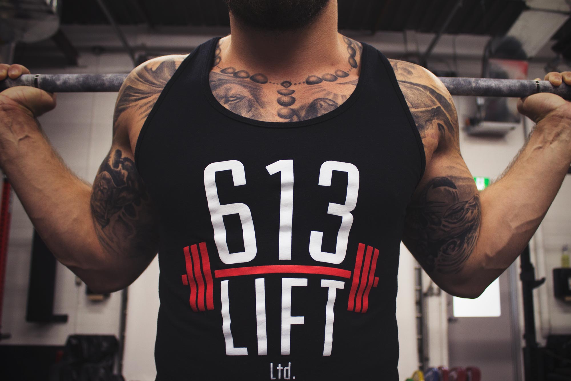
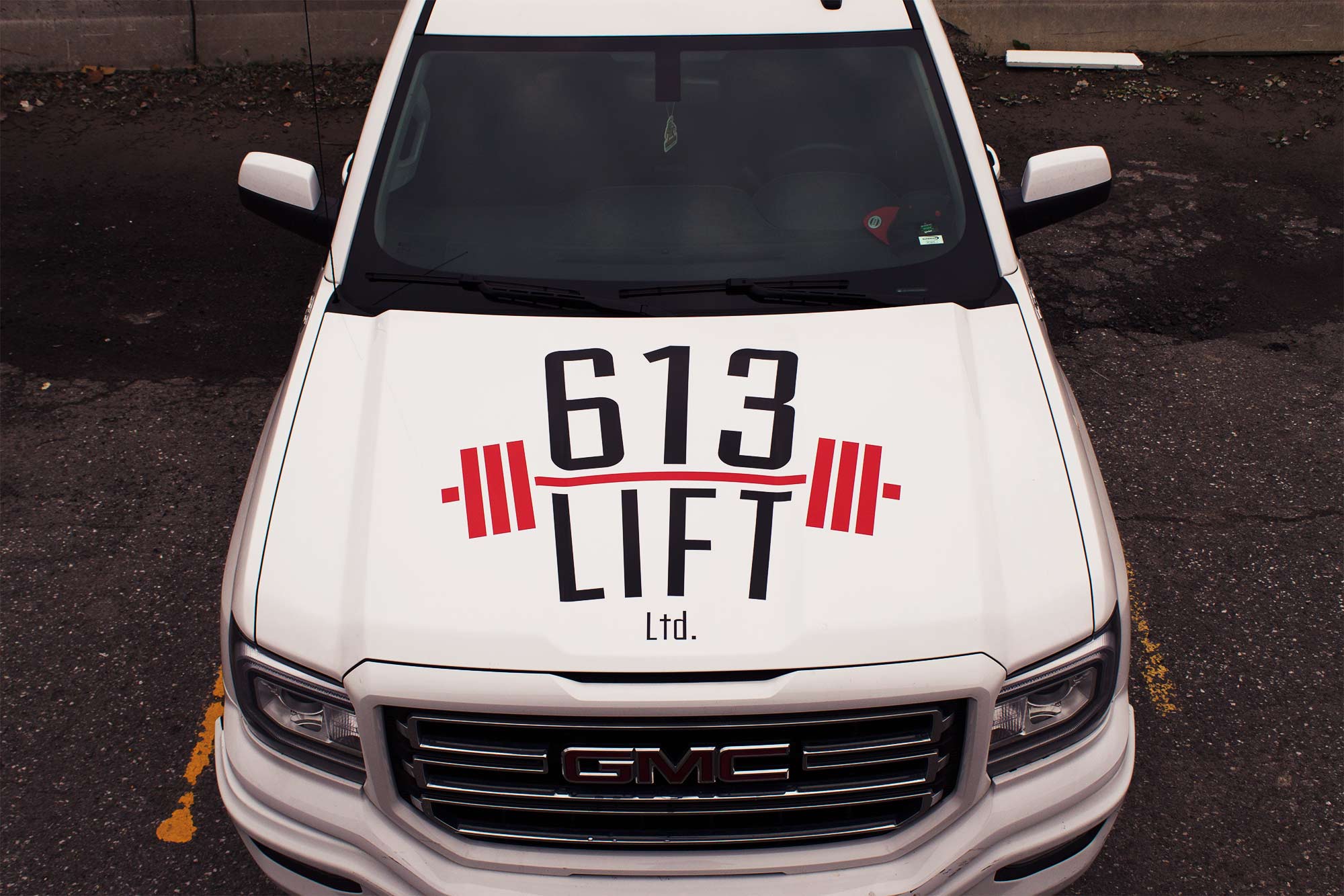
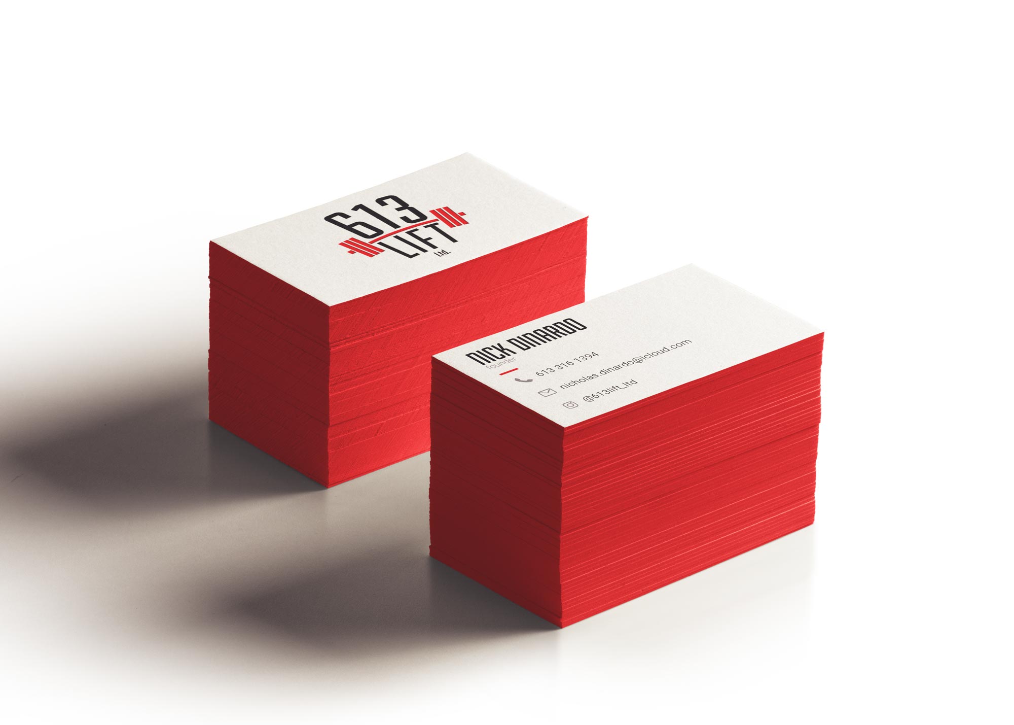
Establishing an Identity
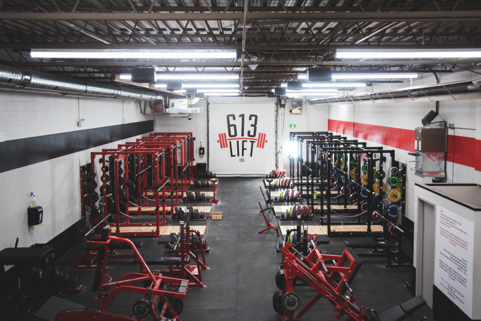
Working with a client who is enthusiastic about their brand is always rewarding. The aim of this project was to create a logo and some secondary brand elements for a new gym, 613 Lift Ltd., in Ottawa, Ontario.

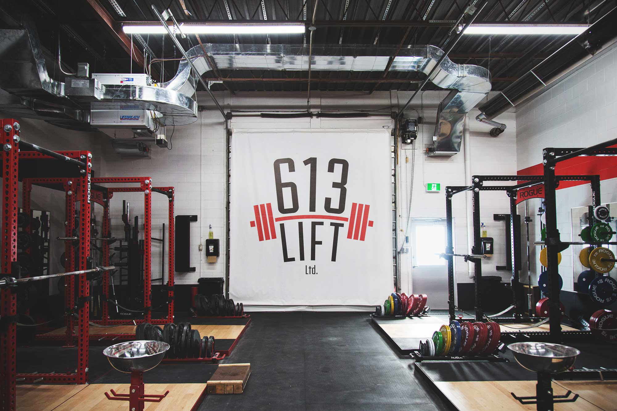
The Design Process
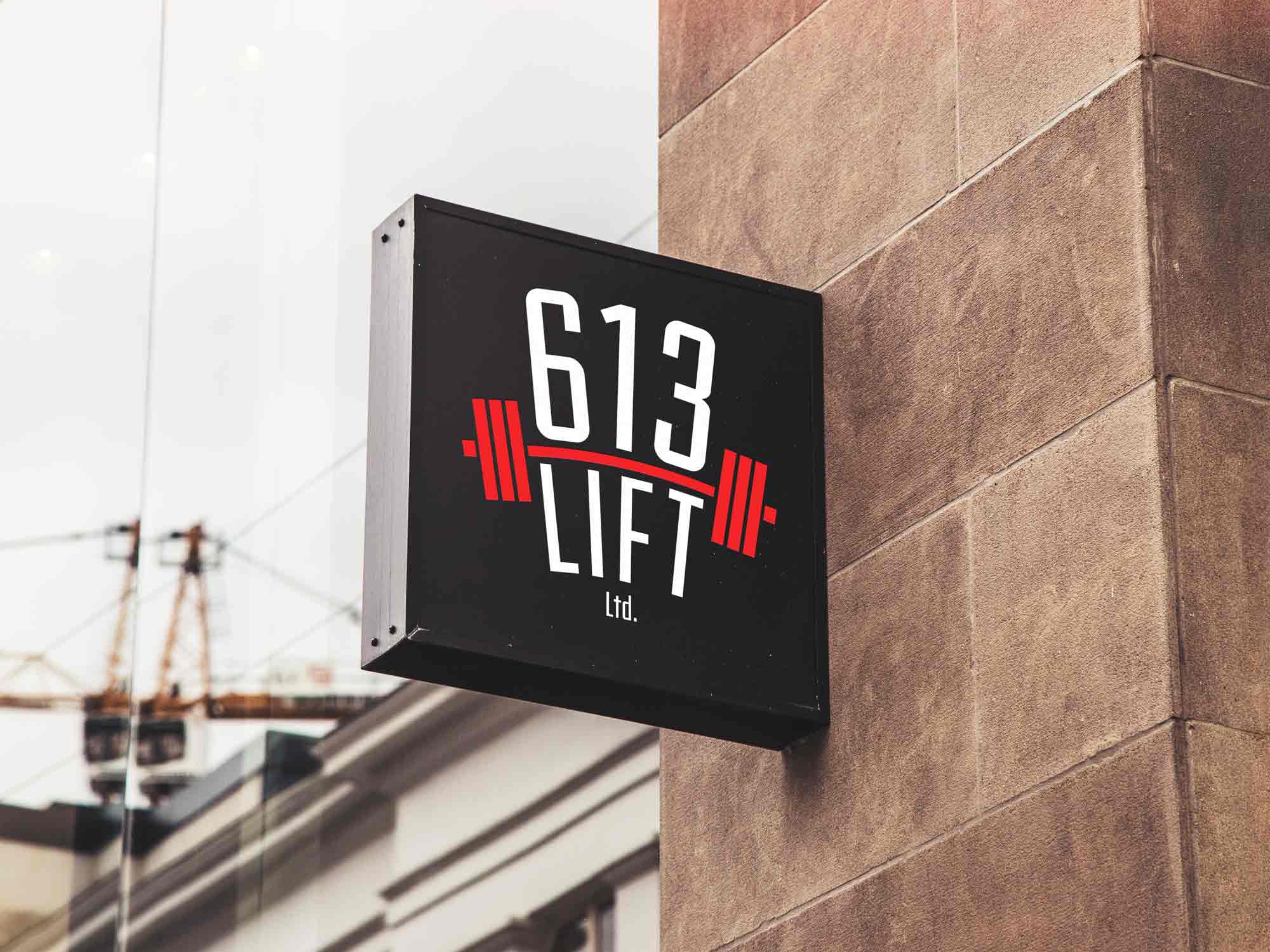
Initially, I experimented with the idea of using a weightlifter's body and the bar to create the shapes for the logo. After exploring a variety of ideas like this and discussing the client's vision, I decided that a simpler design was the better solution. Using a curved bar as opposed to a straight bar made the weights feel heavier and created the impression that they are being lifted instead resting stagnant on the floor. It also serves the purpose of leading the viewer's eye up through the logo, conveying the impression that it is to be held in high regard.
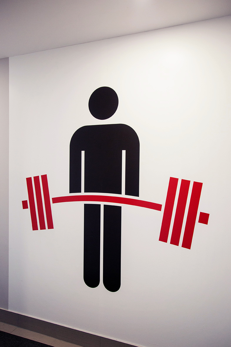
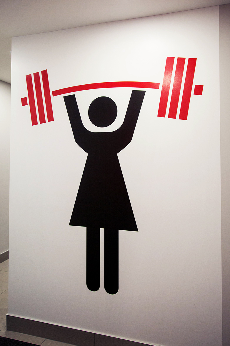
Strength Through Consistency
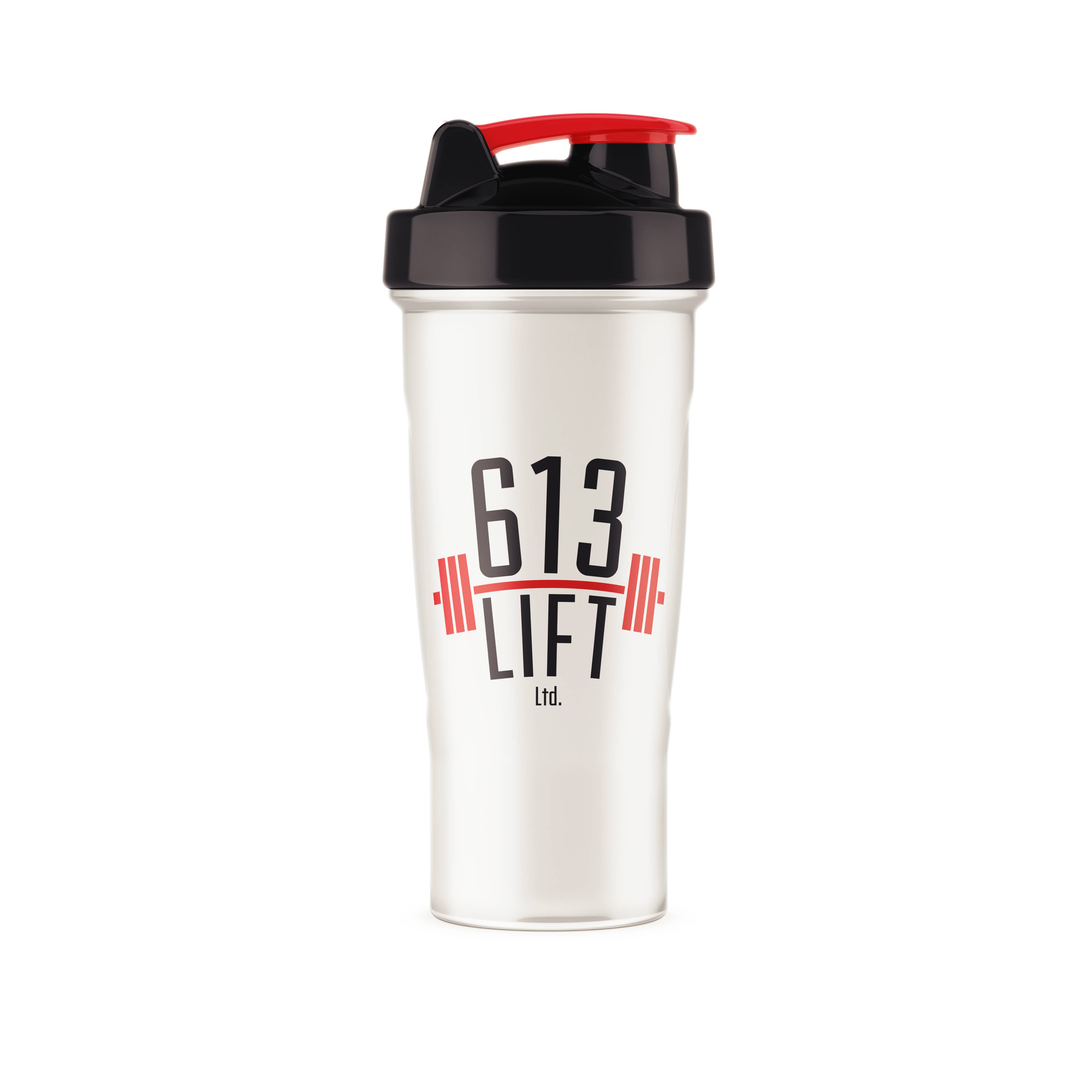
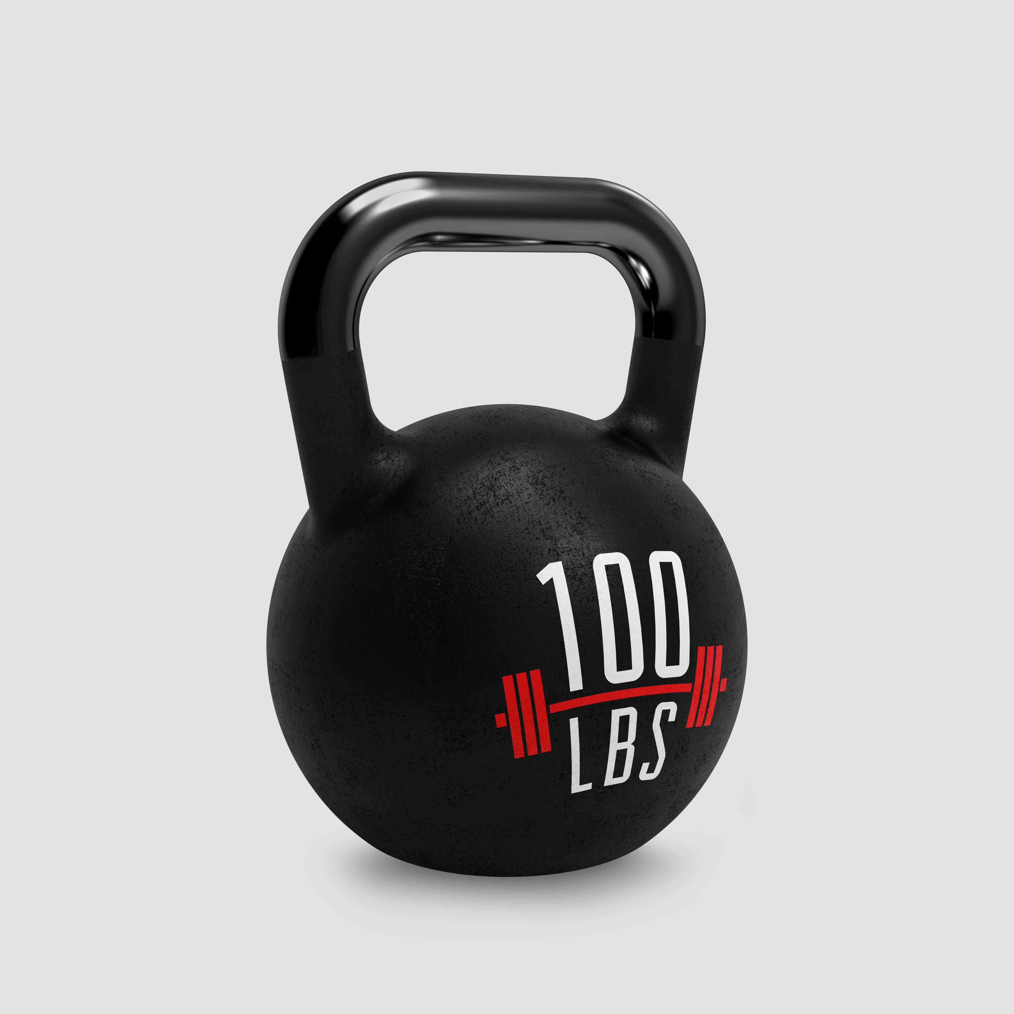
Incorporating the red bar element from the logo into other areas of the brand was a way of putting the 613 Lift stamp on components that typically go unnoticed. For the washroom signs, the bar is the exact same height as the body when it is rotated. This was a deliberate attempt to create more symmetry and consistency in this symbol.

 �
�