Making a Mark
Tight deadlines and pressure can often help to produce great results. For this project, the client - a cycling club located in Ottawa, Ontario - had a race a week after the project brief. They wanted to unveil their new club to the cycling community and needed a logo, fast.

The Design Process
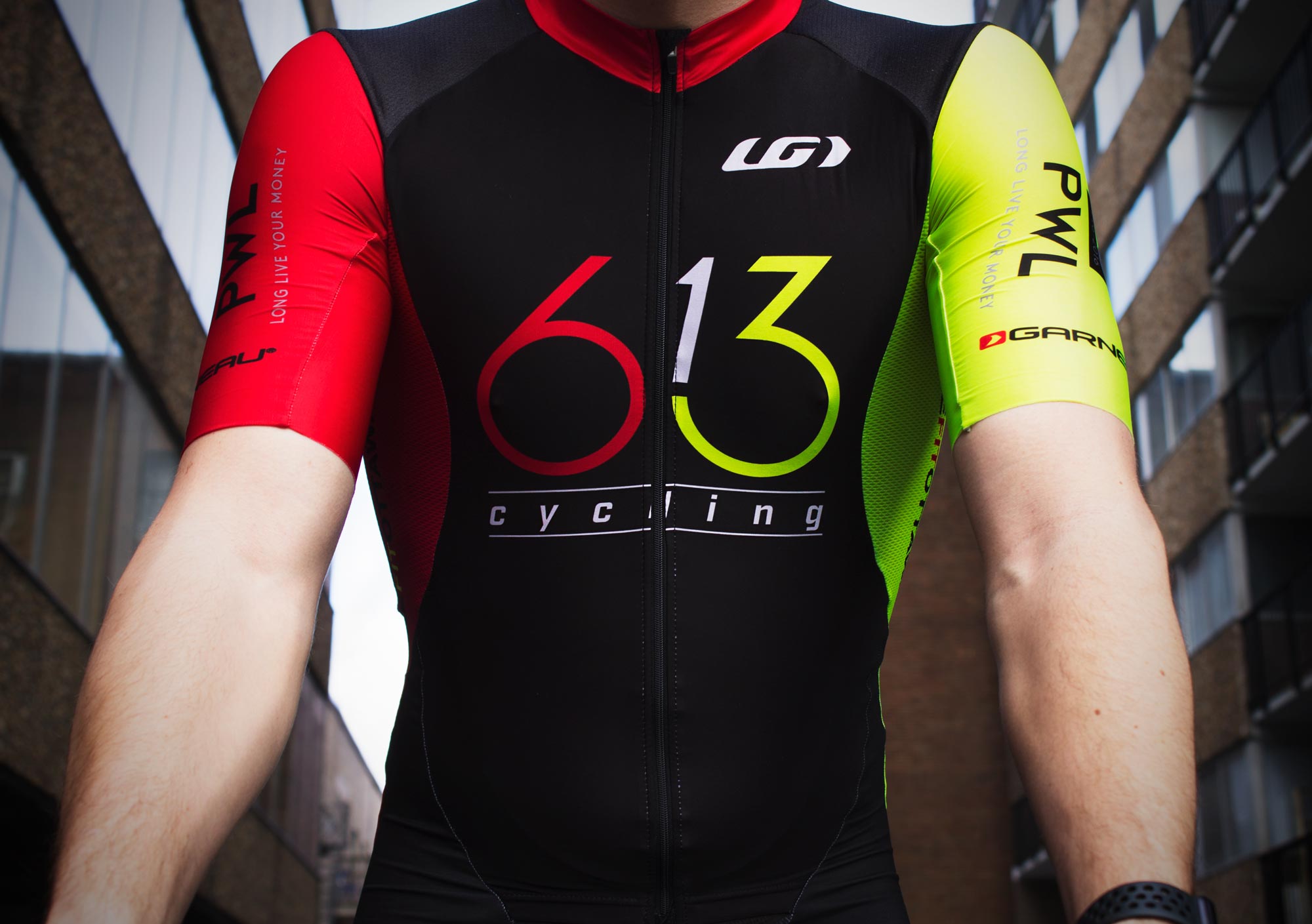
Due to the tight timeline associated with this project, there was not a lot amount of time for the exploration of ideas. Because cyclists often ride in groups and at high speeds, I felt that the appropriate solution was a minimal logo, something that would be recognized and stand out from the crowd when cyclists pass by. The idea to use the numbers as a representation of a bike came fairly quickly in the sketching process. Using the circular forms in the base of the six and the three to symbolize the wheels was a clear choice. The logo was then calibrated and refined to ensure symmetry & consistency.
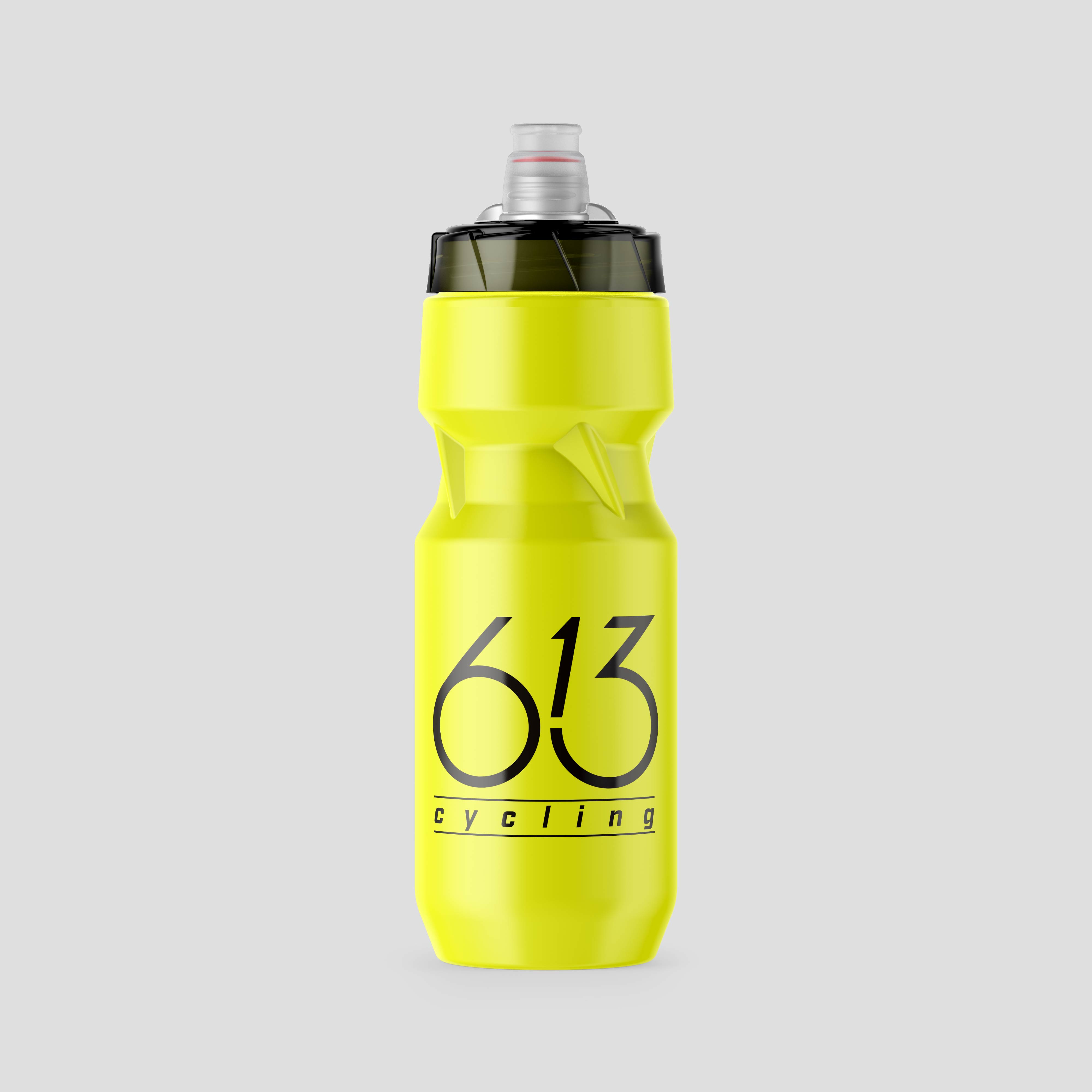
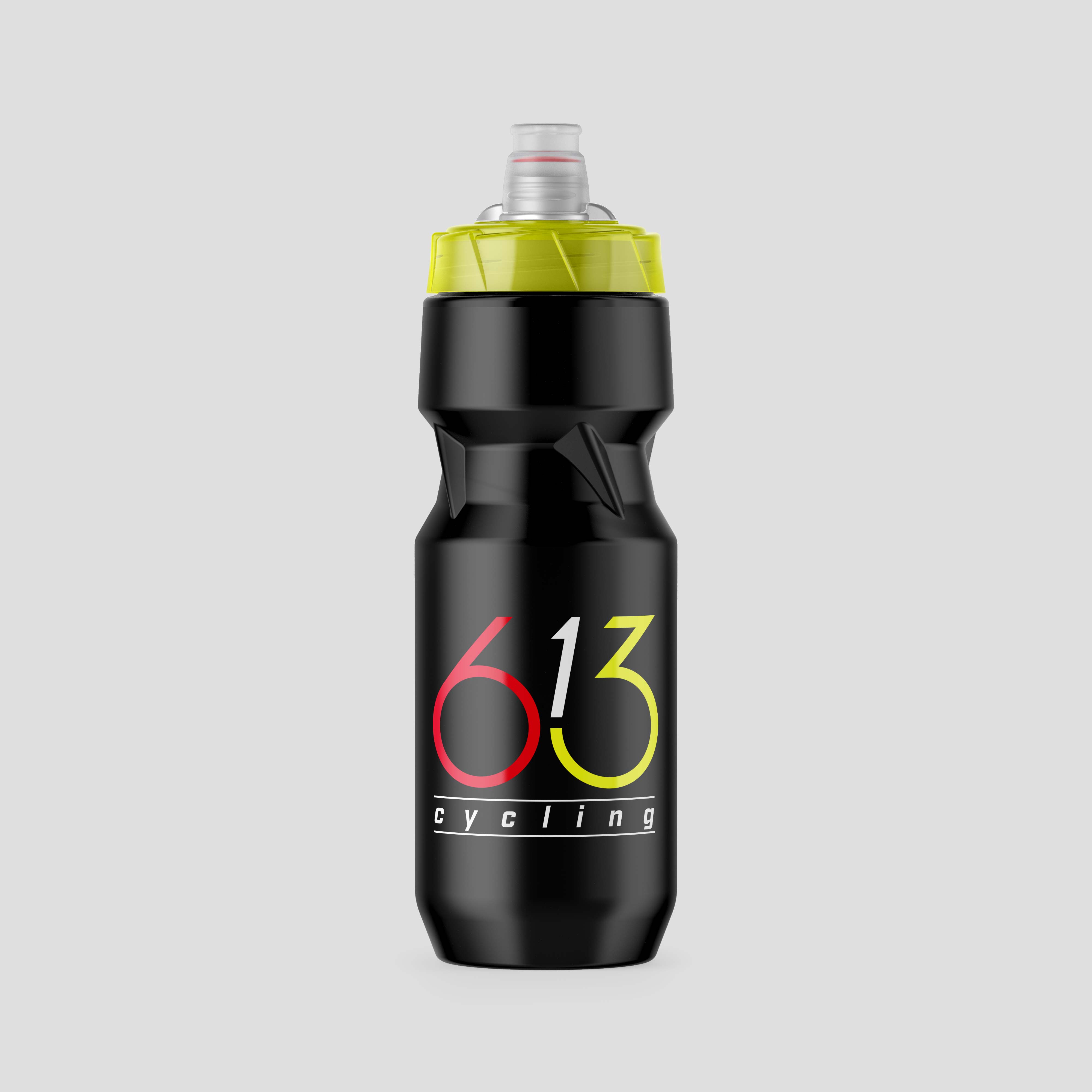
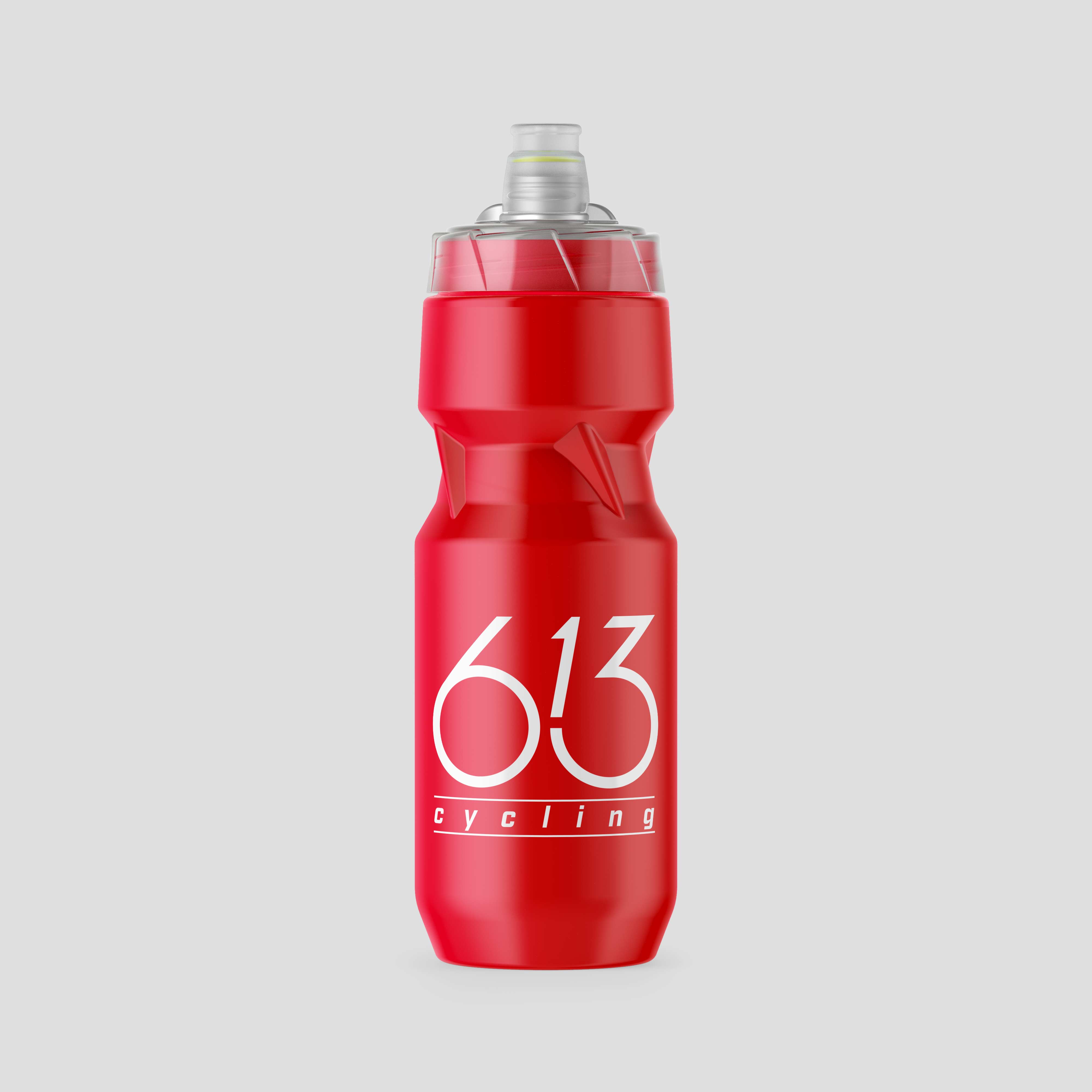
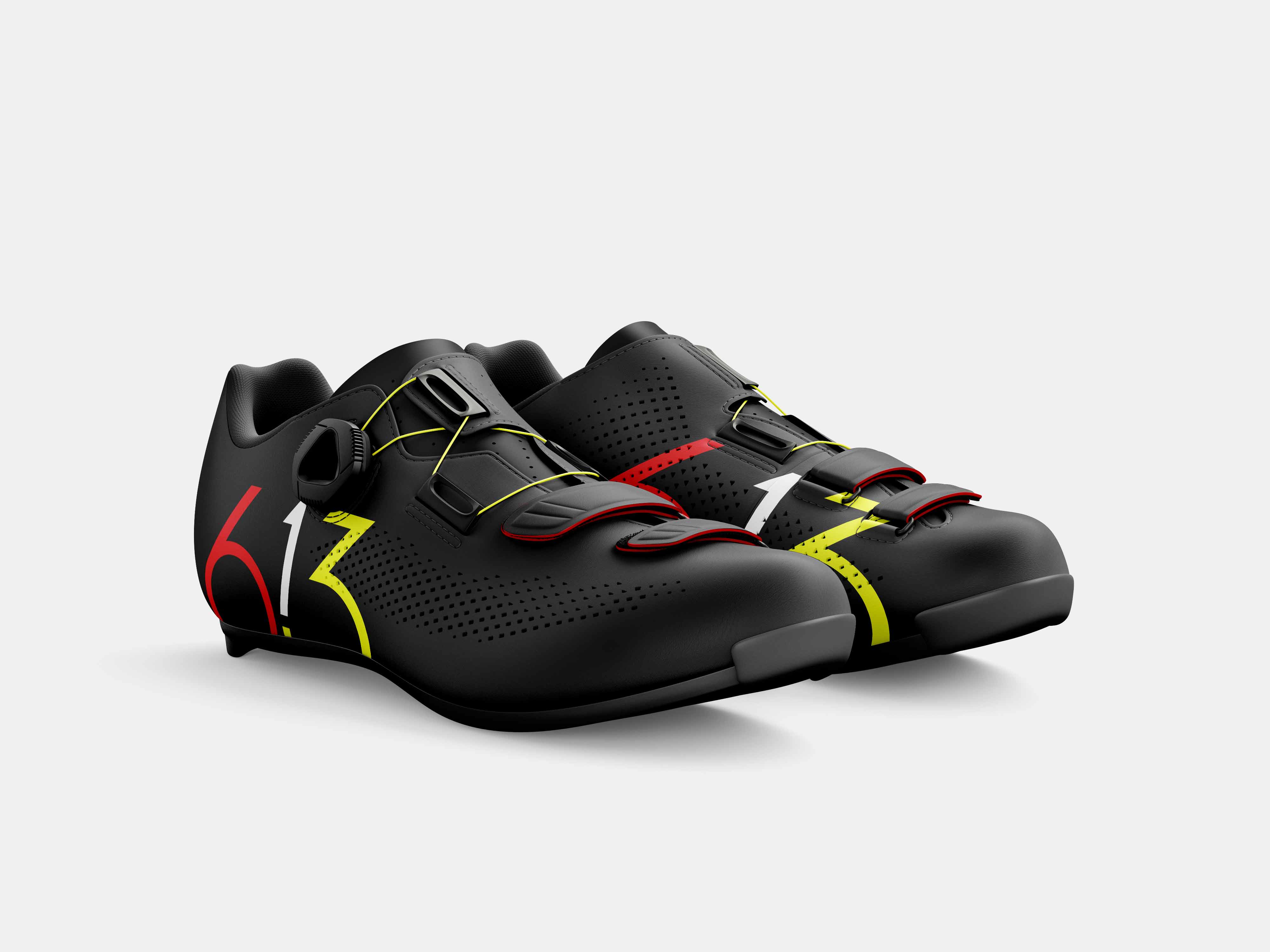
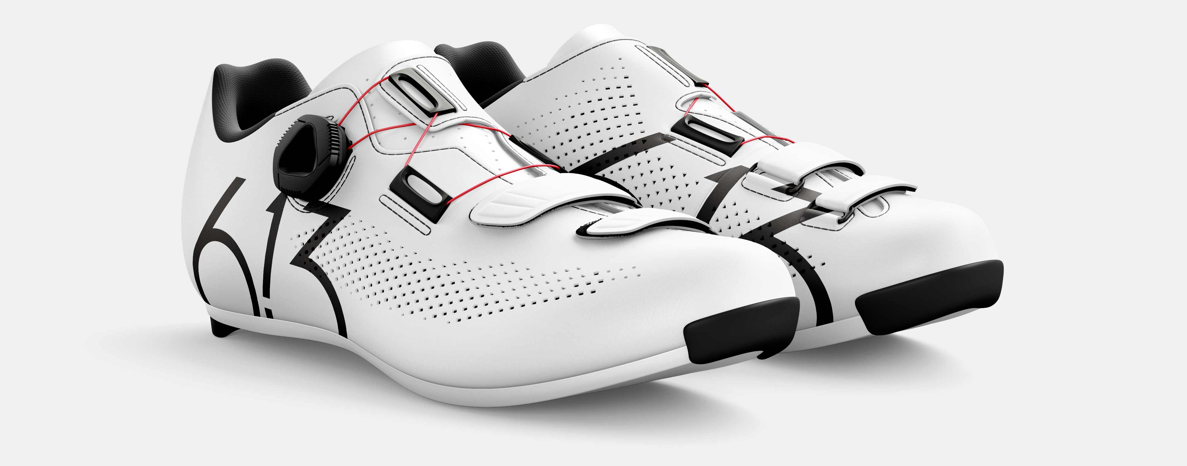
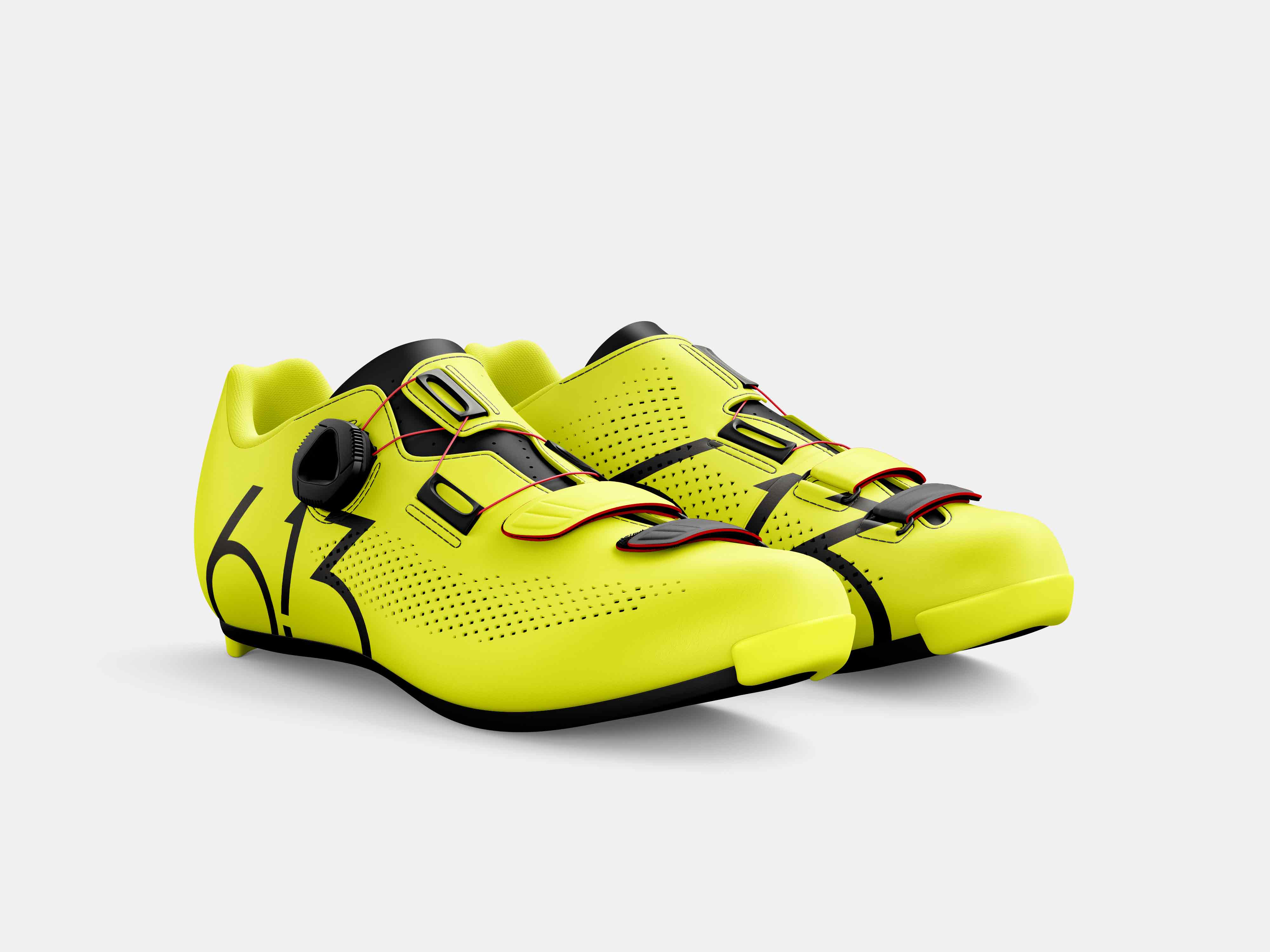
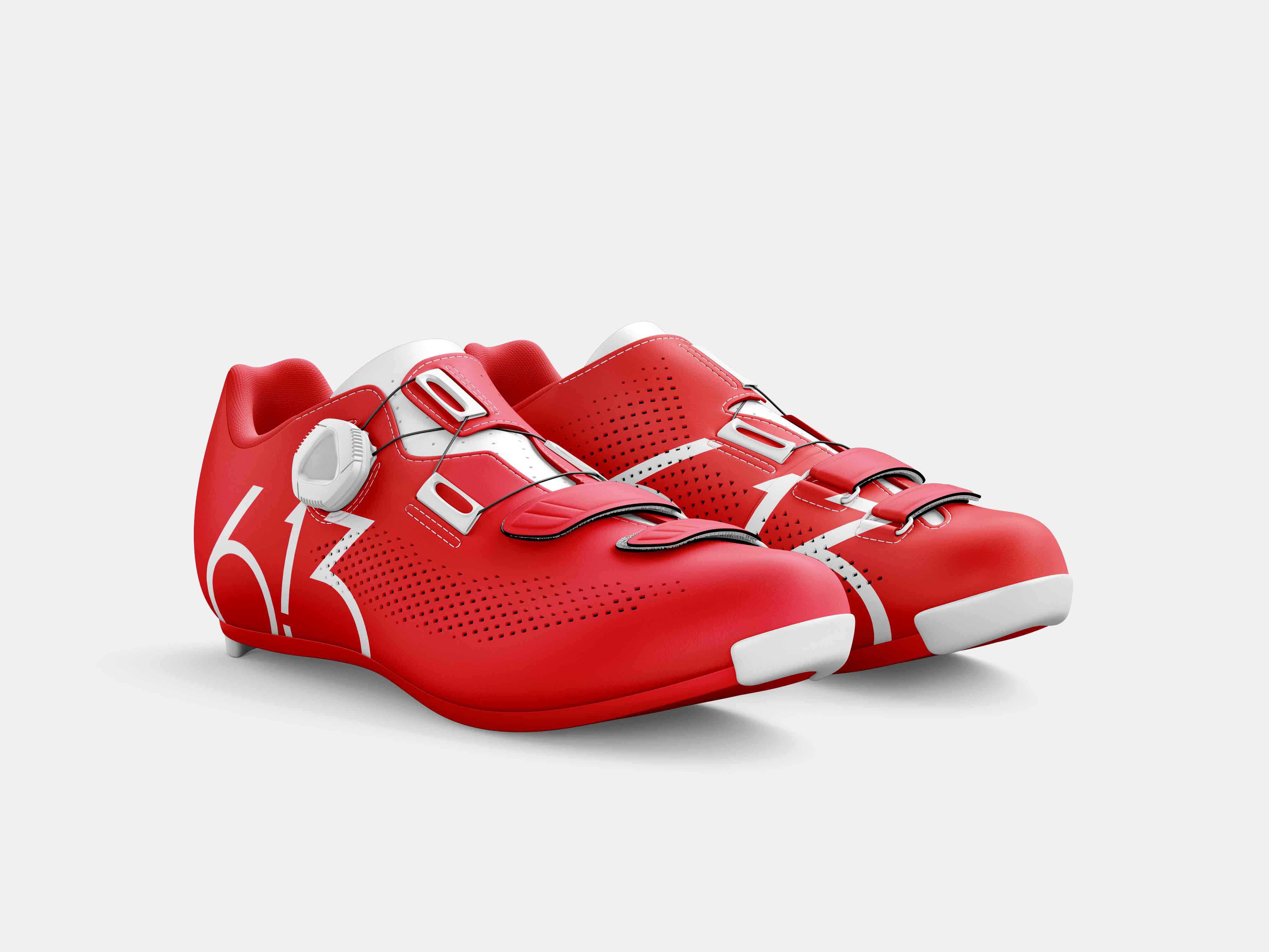
Logo Applications
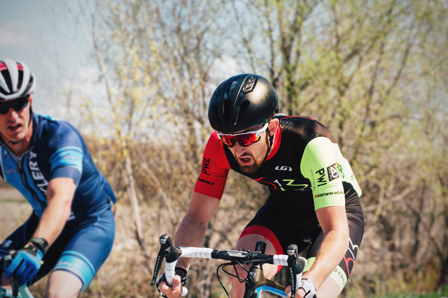
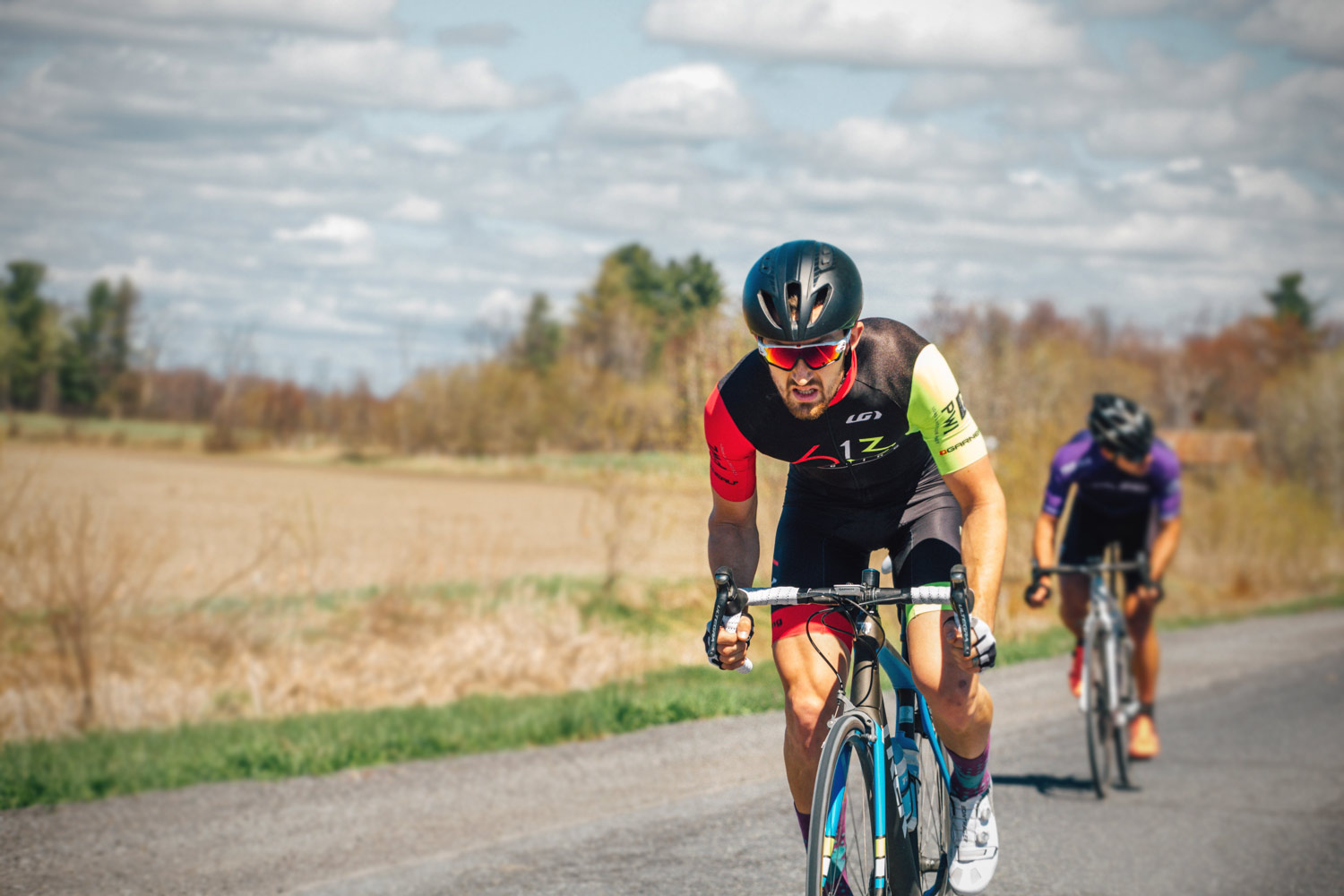
The following are examples of various logo and colour applications pertaining to the 613 Cycling brand. Race photos were taken by Zara Ansar.